
Interpreting Sonograms
The method used to display modulation is through sonograms. These show sound at various frequencies over time as shown in Figure 19. They can be thought of like a sheet of music or an old pianola roll; the left axis is frequency—musical pitch—while the bottom axis is time. The colour indicates the loudness in dB (SPL) with the colour bar at the right providing a key to the loudness associated with each colour. The quietest sounds are shown as black and the loudest shown as white. (In these sonograms much of the colour scale has been made black so that peaks stand out better.)
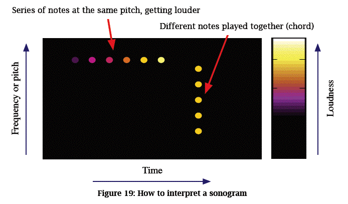
In a sonogram a series of identical notes would appear as a row of dots across the diagram. A musical chord, where notes are played at the same time, would appear as a vertical column of dots on the diagram with highest-pitched notes at the top. Loud notes would appear yellow or while; soft notes would appear purple or black.
previous table of contents next
Copyright of Papers and Intellectual Property of this document, and the physical devices or software described, belong to the respective authors or designers.